
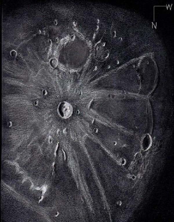
Crater Kepler and its Rays
At nearly 12 days into the current lunation sunlight is bathing young crater
Kepler and its extensive ray system. Kepler falls into the category of a smallish
complex crater (31 km in diameter and 2.75 km deep) with a low peak rising from an
otherwise small flat central floor. Most of the floor is covered with slumped wall
debris. A small part of the inner wall appeared terraced. Crater Kepler lies
between the Oceanus Procellarum and the Mare Insularum both of which are made of
dark lavas. Very prominent rays extend from the rampart and ejecta blanket well
beyond the crater rim for more than 300 km. Some of the rays, especially in the
east, overlap rays of other craters such as Copernicus.
Crater Kepler was named by the Jesuit astronomer Giovanni Battista Riccioli about
28 years after the death of Johannes Kepler. He also named Crater Tycho after
Tycho Brahe, the man with the accurate data measurements that helped make Kepler
famous.
West northwest of Kepler the large old crater close to the terminator is Marius.
Using a higher magnification ocular than that used in this drawing, I could see
several domes to the north of the crater in very good grazing light. Kepler is a
favorite crater target of mine as the moon approaches full phase.
Sketching:
For this sketch I used: black Strathmore 400 Artagain paper 9”x12”, white and
black Conte’ pastel pencils and a blending stump.
Telesccope: 10 inch f/ 5.7 Dobsonian and 9 mm eyepiece 161X
Date: 4-29-2007 2:45-3:45 UT
Temperature: 18° C (65° F)
Clear, calm
Seeing: Antoniadi III
Colongitude 51.8 °
Lunation 11.6 days
Illumination 90.5 %
Frank McCabe
Excellent Sketch,Frank.
Until now,I hav’not attempt create a similar sketch,but after this…, I will try to make one about the .!!!
Peter.
…Sorry,I forgot.. the.!!!
Peter.
Ah, yessss. This is the crater sketch that ‘drew’ my attention to your work. Now that we have many fine examples of lunar sketching to sample from, it appears that those sketches started on white paper invariably end up looking lighter than those sketches using white on black paper. Now should we sketchers ask ourselves is this due to our choice in medium (black or white paper) reflecting our image of the moon OR is this the result of some incomplete efforts on our part to get the hue of the moon correctly? In other words, are we ‘falling short’ (due to laziness, lack of time, or more likely, conservation of precious resources such as Conte pencils) OR do the dark sketches versus the light sketches truly reflect our differing image of the moon?
Peter,
Thank you.
Gerry,
I think the most important factor for me is getting the sketch done before the scene changes. I let my equatorial drive platform run 30 min before I reset it. I have never set it more than twice. If the moon were static and non-changing it would be almost easy to sketch, but what fun would that be? With a few weeks of practice I could sketch faster with white Conte’crayon on black paper than graphite on white. I can also fix mistakes faster. With graphite I found myself needing to continually go over the same areas already sketched to darken them again and again. Often the darkest graphite needs ink added to get rid of the shine. I wish I could master charcoal without making the mess I do, that would probably work well with graphite instead of ink. I continue to sketch with both black and white paper. I would like to add I have never yet seen a lunar sketch I didn’t like no matter how it was made.
Thanks for your remarks.
Frank